The Most Ridiculous Chart On Earth (In All History) September 24 2014
Here we have the states ranked in population, from 1790-1890:
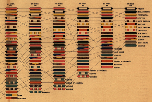
I have never seen anything more absurd than this chart’s color- and pattern-coding. It's a pretty genius way of tracking each state's growth over the years relative to other states, and a bunch of these would have made for some pretty cool flags.
Someone make a tie out of this, please. Two ties. Wallpaper!
Rank of states and territories in population at each census: 1790 - 1890 (1890)