Treemaps and Bar Graphs Bear Child, Terrify Neighborhood September 18 2014
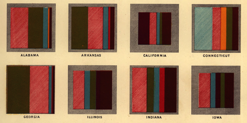
Here's a slice from a chart showing the religious affiliations of Americans in 1870:
First, these are great because they look like fabric swatches for woolen socks.
Secondly, they look remarkably like treemaps but only operate in the horizontal dimension. In the end, it may not be the most readable format, since we end up with some super-skinny slices of Lutherans here and there, but at least it’s easy to see where the Methodists are out and about.

As you can tell from the legend, each color represents a different church. Each state also has a grey boxes framing each block - the grey represents the number of people who didn't select a denomination in the census survey.
Check out the print. (1870)
